Friday, December 17, 2010

Everything is a reflection of something

     After taking pictures this last week, I was looking through all my photos and I realized a lot of the pictures I took were reflections of a lot of things.  I'm not saying this is a good or a bad thing.  If a photo turns out cool from shooting an object as a reflection then you might as well roll with it.  I think for the future I might start deliberately shooting objects from a reflection angle and try and make it look the same as it would without having shot it from as a reflection.  I think its's different and you can get some different looking shots with shooting reflections.  Not only did I do reflections this last week, but I really just took a bunch of random pictures.  I love it when you have no plans on what to take and you just wing it.  A lot of times you can get some really golden shots by not planning anything and just "get the shot" while going through a standard daily routine rather than going out of your way to actually get a photo.  Don't take this the wrong way, there are plenty of good planned out photos, I'm just it's also not impossible to take some lovely shots just while going through your standard operation of life. 
     Most of what I just said probably sounded like I was just rambling.  I tried to express that the best way I could but that most likely came out different than I wanted it too.  Anyways, I will put descriptions on each of my favorite photos. So look below each photo, if you please, to see what I did in shooting it and the editing side of it.  Enjoy these photos, if you feel inclined (by that part of your brian) to enjoy these photos.  Have a Merry New year and a Rockin' Christmas.  

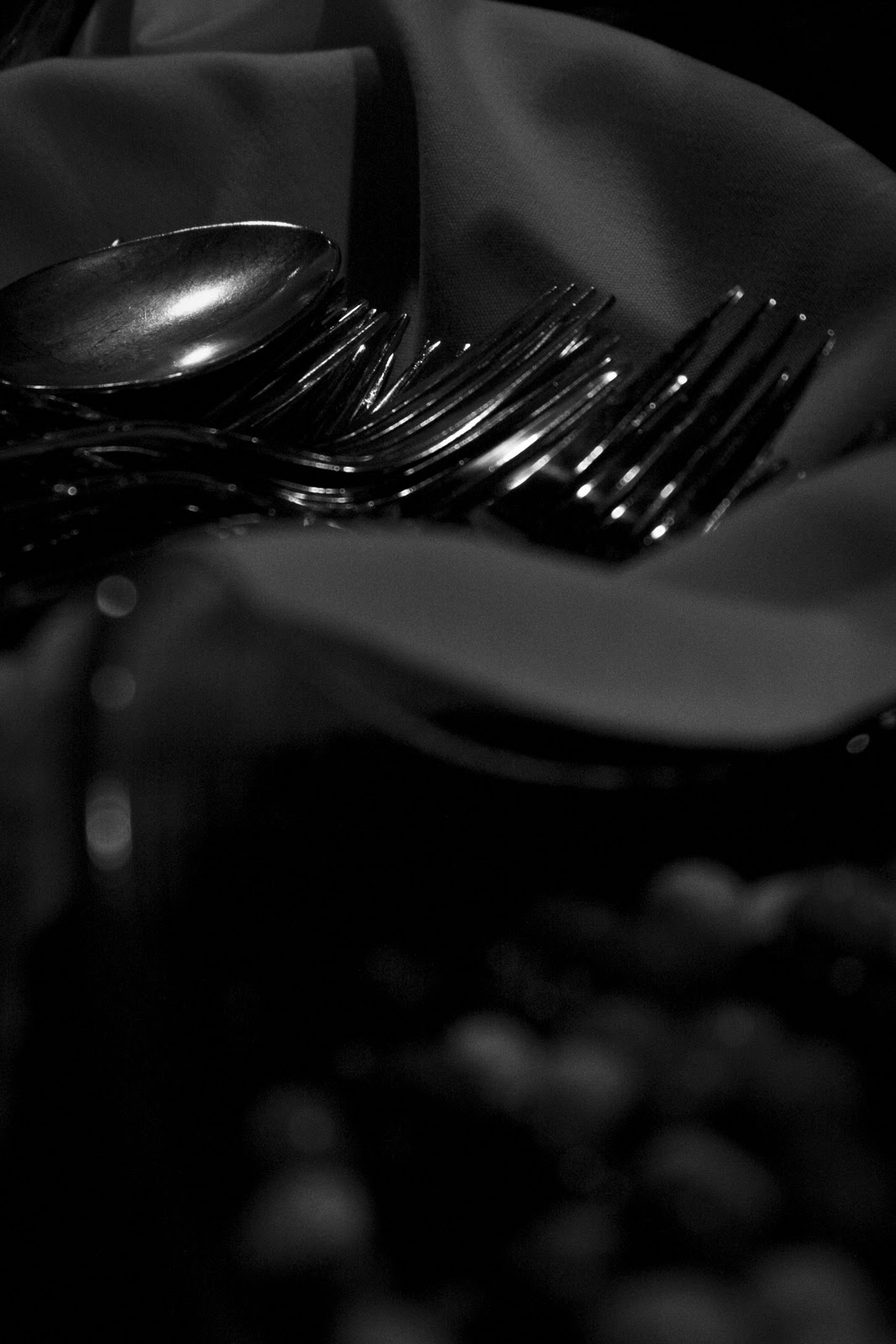
Description: odd, mysterious, unpredictable, unorthodox. This is actually a shot of an elevator button. I desaturated it, and turned down the exposure almost all the way to just get a different picture.
This is my favorite picture out of all of these.  I bumped the contrast up a lot to make the tree turn darker. And since the background is white it make the black tree branches pop out even more.  I desaturated this photo some but not all the way.  I really like how there is a dark black tree line in the background of the photo.  It just adds to the dark eerie side of the photo. 
Shutter Speed: 1/250
Aperture: 5.6
ISO: 200
Most people would hate this photo just cause it's poorly taken and blurry but I like it.   I like how the kid on the left is just an outline of a body.  The blurry face adds to the anger portrayed from these photos.  It almost portrays them as ghosts because there is no detailed outline of their figure.  I got this shot by leaving the shutter speed open for about 4 seconds.  The kid on the outside (on the left) ran around the other two and that is why he turned out as mostly just an outline of a body.  The other two people just stood there and didn't move.  I had to have a low aperture and ISO to compensate for the over exposure I was going to have as a result of leaving the shutter speed open for that long.   On the editing side, I had to turn the exposure down a lot to even be able to see anything.  I bumped the contrast up, and the clarity also a little bit.
oooh thats nice. Yeah,  this shot was taken at Thors pizza on Schweitzer.  All the necessities you need to enjoy a nice slice of pizza, or not.. your choice.   For editing, I just figured I turn down the vibrance some (I know thats pretty standard but figure I would just role with it) I bumped up clarity to make the glass pop out a little more and I also turned up the contrast to darken areas around the salt shaker and everything else.


I like this picture a lot because of all the lines that come about from it.  I'll try and point out as many as I can.   Ok, the handles on top of the condiment dispensers are all consistent together forming a line to the middle of the photo.  Next, the top of the condiment dispensers (the edge of them) form lines to the middle of the photo. Then finally the nozzle of the dispensers forms a line to the middle of the photo.  Moving on to the back portion of photo, there are lines from the bars supporting the gated fence as well as lines from the lane handles going into the food areas.  I know wish I would of put arrows to show you what I'm seeing, but hopefully you can see the same lines I am seeing. 
This is a photo of the crossbars of a railing. I really like how there are a bunch of vertical consecutive  lines  from the supporting crossbars. And when you look just to the right of those ( the back part of the picture) you see the horizontal shade lines on another post, that also adds to the lines in this picture.  For the editing in this, I just turned down the temperature a little bit to add a little blue to the picture and make it a little darker and not as bright.  I bumped up the clarity a little bit as well as some of the contrast. 
When I was taking this photo, I wanted it to overall turn out a little darker.  That is why I left the ISO at 200 and had the SP pretty fast for being inside (with not that much light).  This photo portrays satisfaction to me.  Sam is totally comfortable and relaxed by the fire, he doesn't care for a second what his expression is like.  In editing this, I bumped the contrast a lot to keep the photo as dark as I could and then I desaturated it.  Thats about all I did for the editing.. keeping it pretty simple. 
Shutter Speed: 1/250
Aperture: 5.6
ISO: 200

I think this photo is funny just cause of Sam's reaction and whats going on.   Sam's reaction definitely throws out the word confusion in my opinion.  A confusion that Sam excepts and jut roles with it.  People might say its a horrible photo cause it's crooked and what not, but I like it how it laid out.  That why I didn't want to straighten the picture out, I wanted to leave it just how it came about from the picture.  Once again all I did was bump the contrast on this and desaturated it. I didn't want this photo as dark so that's why I turned down the SP a little bit.   
Shutter Speed: 1/160
Aperture: 5.6
ISO:200
I like how the depth of field on this photo played out. The first little sparkle ball is out of focus as well as the last two.  This puts most the focus on the middle ball.  I tried to darken the corners to even put more of an emphasis on the middles sparkled ball.  In editing this, I bumped the clarity a little bit just to give it a little more detail than it already had,  added some contrast to it, and shifted the temperature just a hair to colors of my satisfaction. 
Shutter Speed:  1/200
Aperture: 4.0
ISO:200

Shutter Speed: 1/100
Aperture: 5.0
ISO: 200
Shutter Speed: 1/100
Aperture: 5.0
ISO: 200
Another blurry like water paint picture.  Looks like the outline of a coffee cup but I actually think it's the outline of a cup of noodles. I can't totally remember. I turned up the vibrance a little to make the brown pop a little better and bumped the clarity a little also. 
All these photos of the water drops on the window are just great, I really like them.  The reason I like them is because you first see the drops on the window, then you see the reflection on the window.  And the reflection adds color to the picture behind the rain drops. Editing wise, I turned the clarity up a lot to emphasize the water drops more and make the pop out in detail. Turned the contrast up a little and turned the temperature down some to give it more of that glassy reflection look.
       Shutter Speed: 1/100
Aperture: 5.0
ISO: 200
Same as picture above: Desaturated 
Shutter Speed: 1/80
Aperture: 5.6
ISO200
Another railing reflection on a deck: look bellow for more details about these railing reflection pictures.
 Shutter Speed: 1/25
Aperture: 4.5
ISO: 200


Ok, so the goal in this photo was to see how many different reflections and how many different pictures I could get jammed into one picture.  It's a little confusing, but this is a tiny layer of rain on a wooden railing. There are two reflections and then the actual picture itself.  On the railing, on the left side of the photo, there are two reflections.  The bottom of the photo is the reflection of the overhanging roof above me.   The top of this photo on the left is the second reflection of a roof tip at another section of the building.  So the upper right of the picture is not a reflection and those are just the white cross bars of the deck.
Shutter Speed: 1/60
Aperture: 4.5
ISO:200
This is a complete reflection of the railing.   The reflection is the underbelly of the overhanging roof.   I like how the reflection adds to an older film look almost.  In certain areas of the picture it's blurry.  It almost looks like a tilt shift lens was used to blur the upper left side of the photo. I thought this turned out pretty cool. 
Shutter Speed: 1/30
Aperture: 5.0
ISO:200
This photo is half a reflection and half the actual picture.   See the outline of the tabasco sauce  on the counter?.. from there and down is the actual picture and above that is all a reflection in the window.  The reflection is the kitchen where the pizza is prepared.  I like this photo because there is smudges on the window making this photo a little blurry not totally clear.  I also like how I made the reflection of the kitchen a little clearer than the actual picture part of the photo.  It almost makes it look like the kitchen part of the photo is the actual photo and from the tabasco sauce down is the reflection but it't not. I think it's pretty cool.

Inspiration: found this blog and a website, it's reflection pictures but I don't believe it's only one photographer that took them all. They are really cool though and good 

Thursday, December 9, 2010

One blog- 2 projects

    Well, I'm going to be completely honest. I have no clue what to write about and what random story I should start rambling about because I don't have one.  I can't even think of some cool story to make up.  Therefore, I am going to plainly explain how, where, and why I took these photos the way I did and what I did.  This week my goal was to try and take some more on point (close up pictures) and try to put my focus on the editing part of the photos.
     It started out as a standard day, sitting in the commons with my life sports class waiting to go play some "exhilarating".. caugh caugh..  "extreme" sports.  While waiting and during the sport activity, I wanted to expand my skills in photography, therefore, I put a lot of energy and focus into these photos.  In saying that, I also wanted to put a lot of emphasis on the editing, to create a blog that will "blow the classical music out of your butt."
     Anyways, lets get down to the editing part which I will post below each picture: (see below). Besides the first few shots, this week I was trying to work on closer up pictures and fixing any major blemishes in photo shop.  I think I did alright on some of them, but I definitely could learn more in photoshop in ways to make peoples faces more clean and appealing.  Any suggestions would be much appreciated on any of the photos more specifically part 2 photos. 
  • exhilarate verb: make (someone) feel very happy, animated, or elated 

    Shutter Speed: 1/125
    Aperture: 5.6
    ISO:200
    I bumped the contrast up a little on this. Obviously desaturated it and then cropped a little bit off the top.  I  like this shot but is seems to get a little busy on the upper part of the photo but besides that I like it. 

    Shutter Speed: 1/25
    Aperture: 5.6
    ISO:200
    This photo I shot blurry and then turned down the exposure in photoshop to get a different water paint affect.  The photo below is shot the same also.  There was a little sunset when I took this one,  and thats how the orange middle strip came about.  I like this photo a lot because its just different and it's cool how the three different colors the blue, the black, and light orange all run together like a water color painting. 


    Shutter Speed: 1/25  
                                                                  Aperture: 5.6
                                                                  ISO: 200

V-Fusion, the drink my friend has every morning in life sports.  A simple, self explanatory picture.  This picture was taken to simply glorify the existence of V8 "The drink that keeps me going, almost as good as a man soda" -Sam Pickens
I desaturated this photo a little, bumped the clarity all the way up, and then turned the contrast up a little to make the picture a little darker.  

Shutter Speed: 1/80 
Aperture:  4.5
ISO:400
                                 
Ok, so I touched up sam's face in photoshop quite a bit.  I used the spot healer to touch up any little blemish marks and then I did a little clone stamping in some areas.  After that, I used the magnetic lasso tool around his eyes to brighten and make his eyes a little more clear.  Next, I got my paint brush tool and lowered the opacity to about 6.  With the paint brush, I sampled a brighter part of his face and just went over his whole face making it smoother and brighter at the same time.  I also turned the clarity almost all the way up and then the contrast a little up to darken the left and right side more than it was so more of the focus would be kept on his face.
Shutter Speed: 1/30
Aperture: 5.6
ISO: 800
Shutter Speed: 1/30
Aperture: 5.6
ISO: 800
     This week was my first time ever shooting in a studio with strobes, with a little help setting up the lights (ok i'll be honest... a lot of help setting up the lights and getting everything right) I got some descent pictures.  This was a treat and different than the usual snapping of photos of people's faces, continually having their facial expressions look like satan, from all the shadows.  Strobes are literally miracle workers sent by good to bring more joy into people's facial expressions and light up their worlds.  Anyways, I enjoyed doing this cause it was something different than what I've been doing.  I think eventually, I would be down to use some strobes in shooting snowboarding down the road.

Part 2
Typical shot of Essex: Attempting to be gangster.  Actually attempting is the wrong word, succeeding would be better.  Tall tees for life. . . actually I sound insane, I need to be medicated.  Yeah im just messin' though, not really into the tall tees but whatever floats your ego.   By all means though, my friend Essex can pull them off.  Anyways, I bumped the clarity up on this and a little bit of the contrast, obviously desaturated the photo, and then I just touched up the face with a spot healer and clone stamp.  Then after that I brightened up his face on the right (the side the smaller strobe was on) with the paint brush.  I also smoothed out some of the wrinkles under his eyes and brightened up his eyes a little with the lasso tool.
Shutter Speed: 1/125
Aperture: 4.0
ISO: 200
The same thing was done to this picture and the next one, editing wise.
Shutter Speed: 1/125
Aperture: 4.0
ISO:200

Shutter Speed: 1/125
Aperture: 5.6
ISO:200

I'd say part 2 of my photos I got my inspiration from Essex Prescott and Stephen Sturges because they are pretty good at taking portrait pictures.  If you feel inclined to check out their blog (don't know why you would.. ha just messin) do so fast because they are officially retiring. 


Thats a wrap ladies and gents. see you next week if God permits. Later


Thursday, December 2, 2010

Road shots

    About a week ago it was opening day weekend at Lookout Mountain and my brother and I as well as all the cousins headed up to the mountain to go snowboard.  The higher elevation we gained on the drive up produced more and more snow the higher we got.  With the excitement of this early season snow fall, I brought my camera to shoot some scenery on the way up. 
     Shooting from a car, while going 65 mph was a little harder than I imagined. You have to have everything just right and on point, to be ready for that split second when some amazing landscape arises. It will be there for a second and then it will be gone, so you always have to be ready to "get the shot."  The lighting is always changing along the road, coming in and out of shadows, going through sun spots, rolling through fog, and any other obstacle that could alter your perfect lighting situation.  Therefore, you have to be on point and ready to change your aperture in a split second.  If you happen to mess that up a little bit, it's not that big of a deal cause you can always fix the exposure in photoshop.  The hardest part for me was being ready with the shutter speed because if you mess up the shutter speed then your photo could turn out a little blurry (out of focus) or could simply end up way to dark, beyond the level of fixing in photo shop without making it grainy.  It took me a little bit to figure out but for the most part I got them in focus with descent lighting.  The one that got a little out of focus was photo #9. Photo #8 was also a little weird on the right side of the photo.  On photo #9 and #8 I should of shot with my shutter speed a little faster I will talk more about those below.  Anyways, thats what I got for road shots for this week.  Getting road shots is a quick, simple way of getting some amazing landscape photos without using a lot of energy.  I look forward to trying this more in the future once I am on the road and traveling a little more. 
     I shot most of these at around 250-350 shutter speed and the aperture I kept pretty low to compensate with the fast shutter speed(to brighten up the pictures a little) because it was foggy and dark in certain areas.  I left my ISO at 200. As far as the actual editing goes, from now on I am going to start explaining the photo and how I edited each photo below each photo.  Just giving everyone the heads up so they know what to look for in the future.  Thanks and hope you enjoy!

America! This photo I obviously desaturated, I bumped up the clarity all the way and a little bit of the contrast to make it a little darker in some areas.  I cropped this photo quite a bit also, took out the road and couple other things.  There was also a pole to the right of the sign that I took out with my clone stamp.   I really like how the fog is behind the Veterans Memorial sign, with all the white fog behind the sign it makes the sign pop out more.  I also like how the fog comes through the picture at an angle and then in the upper left corner a part of the mountain line still comes through. 

I think this picture is still pretty cool looking but it's definitely not one of my favorite out of all of these.   It's just pretty simple, nothing really makes the picture supper awesome and different.  In saying that its simple, I kept the editing simple, turned the clarity all the way up and put the contrast up a little bit.  I cropped the top of the photo a little bit.  Then I moved the saturation down just enough to make some of the dominant colors pop out. 

This photo was my favorite by far out of all of them.  The reason why is because its different, doesn't look perfect by any means, and the photo was awesome even before I opened it in photoshop.  I turned up the clarity and that was about it except adding some hue on the left a little bit.   The white film look hue over the sign on the right was there just from the reflection off the window or something and I really like how that came about.   To add to it, I took my paint brush and painted red, with my opacity around 6-10.  I did that on the upper left and in the middle some.  The reason I did this is because there was already that natural white hue on the right of the picture so I figured I would just add some red hue on the left to contribute to the photo and make it a little film like. 


On the editing side of this one I pumped the clarity all the way up and the contrast a little.  I cropped the bottom of the photo a little bit.  I like how the sun right above the tree line blows out the sky a little bit and comes through the trees and brings out some of the green in the trees at the top. 

On this one, I messed with the temperature of the photo and made it a little greener.  Turned the clarity all the way up and some contrast.  This is probably my favorite of these three tree ones because the sun really blows out the top of the trees on the left and the sky.  Since that blows out the sky and some of the trees it makes my focus go to the white snowy  trees.  The green sun flair also adds to this photo. 

On this photo I turned down the vibrance some to get a darker feeling to the photo.  It makes the water  look more eerie and mysterious.  I bumped the clarity up all the way on this photo.  At first I thought I didn't like how the tree to the right is blurry but the more I look at this photo, I don't mind it as much because if the tree was fully in focus it could take some attention away from the lake which is the main focus.
I really like this one but  the whole picture turned out a little blurry as a result of  not having not a fast enough shutter speed.  I should of shot this at 400 shutter speed and if the photo turned out a little dark, I always could of fixed the exposure in photoshop. Besides that though, I bumped the clarity up a little bit on this and then I turned the vibrance down a hair.  

Turned the clarity up, vibrance down a little. Saturation down a air.  Cropped it a little. I like this cause it has a little bit of everything in it.  The mountains, with snow, river, bushes, trees, etc. It's as lovely as a dove.


My inspiration is Essex Prescott and I am going to explain why. . . He is pretty good at taking landscapes, I mean he could touch up and perfect a few techniques in landscape but for the most part they were good enough to inspire me to try and snap a few along the road.  Check Essex's stuff out before it goes out of style. 


Friday, November 19, 2010

Dance Party

      About a week and a half ago, my friend Jake Pereria was generous enough to invite me to get my dance on at his younger brothers 16th birthday party on a cruise boat.  It just so happened to start at 8:00 P.M. (my hyper hour) therefore, it didn't take much to get me partying down on the dance floor.  I looked around me and soon realized I was surrounded by a bunch of sophmores.. which quickly diminished my natural 8:00 O'clock high.  No worries though, I was still having a blast... I just busted out my camera for awhile and snapped some shots of how much fun Levi and his friends had. 

     Ok, so this is probably one of the harder "action" things I shot.  It's not really a full out action activity, but everyone was still jumping around like a bunch of monkeys who accidentally snorted cocaine.  It took me awhile to figure out how I was going to shoot and once I thought I figured out the right shutter speed, flash, or ISO amount, it changed on me and I had too try something new.  Some of these pictures turned out a little better than others.  In my eyes, the photos I shot that night didn't turn out as well if there was no motion blur.  Motion blur was pretty necessary for the photos I wanted to create that night.  Therefore, for most the night, I left the shutter speed anywhere from 1 to 2.5 seconds open to create that motion blur and get some different, unique colors from all the lights bouncing around.  At first I had my ISO low, but quickly realized it was necessary to to have it at 800 or 1600 if I wanted to get a photo I could even see on the dark dance floor.  Like I said, the room was pretty dark so I kept my aperture as low as it could go, so around 4.6, 5.6.

     On the editing side of the pictures, on all of them I kept it pretty standard.  I kept the editing simple and didn't get to fancy in photoshop.  On most of them I just bumped the clarity up. And on some, I moved the contrast up.  I left the original colors the same on most of them, but for couple I made some of the yellow blur motion pop out a little more.. i believe I did that on photo # 1&5.  In these pictures I was trying to create an image that showed people having fun in a different way than just a standard, flash still picture with no life.  I wanted to add life and energy to these pictures and that is what I was trying to go for when shooting these. 

I like this photo because there was a bright light coming from the bathroom on the cruise boat which left a cool orange like burn down the middle of the picture.  The main focus, the girls dancing, aren't too blurry so that is nice also. 

This one of my friend Jake Tawves, is a great example of how you should party at a dance party.   The thing I like about this photo is that the kid at the bottom of the picture is pretty blurry and then his arms above his head are blown out, and pretty over exposed which I kind of like.  The reason I like that is because when I initially look at this photo, my eye gets drawn to the brightness of his arm which is right below Jake (the main focus of the picture).  Right after my eye sees the white, blown out arm, it moves up to Jake (the main focus), who is having a blast!

The same thing goes along with this photo,  my eye first goes to the bright orange motion blur and then it moves up where there is nothing else except blurry heads.  After that, I realize nothing is high up on the photo so my eye quickly moves down to a not perfectly focused Jake but focused (better than anything else in the picture) enough to be the main focus of the picture.  


I like this picture a lot, probably one of my favorite because the first thing my eye goes to is the main focus of the picture.  Danny is the main focus of the picture... he is in the middle of the dance floor and he is pretty much the only person lit up bright, with motion blur.  The people circled around him staring at him also adds to the picture showing the viewers that Danny is the main focus. 
This one is great and different from the rest because there isn't as much motion blur in this picture.  They are both very enthusiastic looking in this picture showing the true image of the energetic dance floor. 


This is Jake and Kate just having a lovely time.  I like this picture because almost everything around Jake and Kate is black except for the minimal motion blur centered around Jake and Kate.  With the surrounding black background it makes Jake and Kate pop out more, putting more of an emphasis on themselves.  


I like how the orange motion blur almost creates a backwards half moon around the kids head and then his hand are in focus fairly well.  It circles the attention around the kid and his actions. And his facial expression is pretty priceless. 


I just wanted to desaturated these next photos because I didn't really like how the motion blur colors worked out.  Therefore, I figured I would see what they look like desaturated and in my eyes they turned out pretty cool looking.  If you look closely you can see where the motion blur was and by desaturating the pictures it creates a white foggy look around the picture making it a flawed which I like.  Depending how bright the motion blur was in certain pictures, with desaturating it, It would also blow out that area making way over exposed white which as cool film like affect or whatever you call that to the picture. 


This one I didn't exaggerate as much with the grain look.  I believe I kept the ISO at 400, it was dark out on the cruise so I didn't want to keep my ISO  to low or everything would of turned out black.  The desaturated look brings out the shiny silverware more than the rainbow colored M&Ms. 
I shot this at 1600 ISO, note  the grainy look.   I desaturated it all the way and turned the contrast all the way up.   I  brought the clarity down a little and made this image into an imperfect looking picture which I like.  Its different from the average picture that always looks perfect with the fancy silverware on the table


I got my inspiration from Sadii because she does a lot of motion blur and is very good at it. Check her stuff out, its the hottest stuff on the market. get it why its there

www.sadiiprospect.wordpress.com