Friday, May 20, 2011

The two hundred and eight project

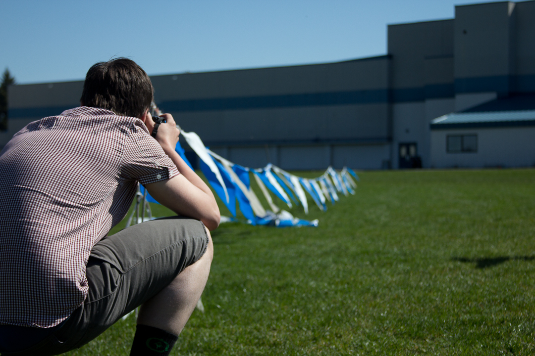
     There are many words that can be used to describe a farm... a few of them are: crappy, stressful, animals, llama raiders, mud.  Those are just a few words that kind of describe the downside of the farm.  On the other hand though, there are many more beneficial factors that outweigh the bad ones.  Other words that describe this farm in a positive way are: peaceful, laid back, revitalizing, refreshing, and old school stylin'.  In saying that, I documented the land of the mini farm on the corner of Hayden Lake Rd and Honeysuckle.  This is a really cool little farm on the corner there and I really hope it doesn't change in the future because it adds to the small town feeling of Hayden.  As much as I wish the farm would never go away, I have a feeling that sometime within the next 10 years this farm could be bought out (once the economy got better) and 10 + homes could be built on that nicely located land.

     In saying that, the photos below are the pictures of the farm.  I hope they benefit some person in the future to see what the town of Hayden used to look like before money started controlling the little city. Hope you enjoy. And remember money controls most peoples lives... try your best not to fall under that type of category of people.


   I got my inspiration from this guy named Christopher Durst. Type his name on google and you'll have some pictures that will blow the classical music out your butt. Ladies and gents check it out.

http://www.christopherdurst.com/index.php#mi=2&pt=1&pi=10000&s=5&p=11&a=0&at=0

Friday, May 13, 2011

Dinkin around the school

          This one day in the beautiful city of Coeur d' Alene a group of kids from the highschool went out and explored around the school and documented what they saw in front of their eyeballs. I was apart of those kids running around causing havoc, blowing things up, and taking a few pictures.  The pictures below are some of the items around the school that seemed to be pretty cool.  I liked doing this project more than I thought I would.  And even though all of us were limited to taking pictures right around the school, we all happened to come up with some descent pictures. By all means, analyze, judge, and pick apart these pictures like there is no tomorrow. And remember whatever you do... "Don't do it in the park."

For editing, I bumped the contrast, as well as the clarity a little bit.  I then made the sky a little more blue by bumping up the temperature.  As far as the picture goes, I like how its in focus on the right and the fence is on the right and it moves to the bottom left.  I just really like how this photo laid out.  
This shot is cool too. I edited this picture the same way I did the top picture. 

I shot these little flowers through a fence and I wasn't really excited about the picture so I put a major vignette on it  and then desaturated the picture. I then bumped the contrast up all the way. I then turned up the grain a little just for the heck of it. 
Stephhhen the Sturgggeess 
Flags.. its a party
It's an E-SSEX
I like this photo a lot for some reason.  The reason I like this is because of the that diagonal  shadow line going through the "Why Pay More?" sign thing on the outhouse. I added a vignette to this and bumped the contrast and clarity.  
I had to get low and dirty on this picture.  I like the angle on this shot a lot.  I also like how this flower is surrounded by concrete and nothing else is around it.  I think of isolation when I see this picture. 

I shot this picture 

Stephen is not always the one behind the lens... hes been known to bust out a few poses for the camera. Cheaa!

I got my inspiration from this is guy named Matt Black.  I found his site from searching the blog of 500 photographers.  
Although his pictures really don't relate a ton to my pictures I took this week, I still like his work a lot and it's supper sick. I will link his blog as well as his website. Thanks and have a good week. 


Thursday, May 5, 2011

   One late afternoon while I was in Tahoe this last trip, I didn't feel like snowboarding so I told my friend Colton I would try and get a few shots of him.  I really enjoyed filming.  You wouldn't think so but it is very hard to find good angles for snowboard.  My friend Colton gave me some pointers in where to stand for a couple of them and then I started figuring it out.  The location of the setup was just in his backyard. 


http://www.vimeo.com/23389980


I got my inspiration from my friend Mike Miller. He has been in the snow and skate industry for awhile and he knows what he is doing behind a camera as well as a computer.   He doesn't really have a website but I will give you a link to his vimeo account to check out some of his edits. 

Wednesday, May 4, 2011

Family Walks are Nice 4/29/11

      Every once in awhile my family and I go on a walk together around our house.  It was really mellow and I just wanted to take my camera along and snap some photos.  Life is always such a rush that sometimes it's really nice just to slow down for a little and just go walk around and chill with the fam.  All of these pictures were taken on the walk except the last one with the bear.  

This is a picture of a stream in front of my house.  I got pretty low to get the shot and my f-stop # was as low as it could go.  Thats why the rock and only a little bit of the stream is in focus. Everything else is blurred more than an old ladies vision.   
Grass as well as that green stuff.  This is another nice picture with  depth of field.
When I look at this picture it just really touches my heart and makes think of love.   NOT! are you kidding me.. don't even listen to me. Anyways though, i like this picture a lot. When we were on this walk my sister got some water from the stream and I drew this heart on this rock.
This is a picture of another stream.  
Well this is a picture of a branch.. the question is, is there any point to it? NO absolutely not but I was there at the time and figured it would make a cool picture.  Although its pretty dumb, I like all the different colors in this picture.  For editing, I bumped the contrast as well as a little bit of the clarity

Family!
I like the colors. Black trees to blue skies. Probably one of my favorite color combos.
COOL
Death Stick!

I got my inspiration from DIY photography.  I read up on depth of field on their site and it inspired me to take some close up, eye level, strong depth of field photos.

http://www.diyphotography.net/depth_of_field

Sunday, May 1, 2011

Mammoth and Tahoe= fun times! 4/22/11

 It's always a privilege being in mammoth getting to hang with my mom's side of the family.  Every year we go to mammoth and visit my moms side of the family and often times I am so focused on my snowboarding, I forgot how much of a blessing my family is to me and how much they mean to me.  If I had to give any advice to people out there.. it would be don't take your family for granted. You never know what could happen in the future so appreciate their presence everyday and don't let the little things work you up because in the end they aren't that big of a deal compared to life itself. 

     With that being said, this is my little cousin and she is 14 years younger than me.  She had a long car ride to mammoth and was passed out on the couch there so I figured it was a perfect opportunity to get some pictures of a peaceful child at rest.  Don't rush through your childhood.. soak all of it in!
family: the most important people in an individuals life 

I was experimenting a little bit on this picture and turned the clarity down some rather than up a little bit.  I like how the face is a little more dull and how it really emphasizes the smoothness of a child's face.  If I could go back though, I would of not turned down the the clarity quite as much.  I then obviously desaturated the picture and turned up the contrast some. 
I like the depth of field a lot on this picture and how the couch before her is all blurry.  I turned down the vibrance some on this and then bumped the contrast up some.  I then lightened her face a little bit and bumped the exposure a hair.  And then I turned up the clarity a little. 
I like this photo except for the fact that her right cheek looks like it has pink on it from  the reflection of her shirt.  I tried to fix it some but it didn't work out as well as I thought. By all means though, its still a really cool photo. 

This one is a little better.  I like how I put her knee in the shot also and got that out of focus.  It shows the direction of where her body is going yet it's blurry so it leaves all of the focus on her face still.  I bumped the contrast, the clarity a hair and turned down the temperature a little.  On about all of these pictures of my little cousin, I turned down the temperature because the color of the light above made the picture more yellow than normal. 
This is my little cousin Sterling.  Since there are three very similar photos, I am  going to talk about this one and it will kind of represent the other too.  Ok so in these photos, I put his face under a light to try and light up both sides of his face. It did a pretty good job of lighting up his face.  As far as editing went though, I bumped the contrast a little, and turned down the exposure, then used the vignetting tool to darken the corners.  I then used the bandage tool to touch up his face.  After that, I lightened his face with sampling a lighter part of his face and using the paint tool to lighten up some of the darker parts of the picture. 


A bear.. photo credit: Paul Haran.  I was in so much shock from seeing this bear outside of my friends house.. I forgot how to use my camera so I gave it to him real fast hah. Hopefully that won't ever happen again. 
This is a picture through a pair of my sunglass of lake tahoe.  I set the exposure the part inside the sunglass lens would be a little under exposed and then the outside would be a little over exposed.  I had to do that or else part of it would of been way to dark or way to over exposed. I then just sharpened the picture a little bit and bumped the contrast some and that's about it. 
I like this picture.  The water colors are incredible and so summer warm feeling yet there is still snow in the mountains off in the distance.  I bumped the contrast, used the vignetting tool, and cropped it some. 
Same applies for this except the darkening of the edges.

I got my inspiration from an influential artist and business man in the snowboard industry.. Corey Smith

http://www.highpoweredstreetdrugs.com/